He shoots, he misses!
Graphics: 5/10
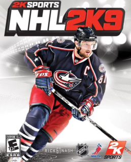
The arenas in this game look absolutely fantastic. The working JumboTrons and LED display banners are very impressive; animations, almost exactly like the same as the ones displayed on the banners of real-life NHL arenas, are displayed in the game. The developers' attention to detail is respectable, as even signage such as The Canucks For Kids Fund in GM Place, are duplicated and displayed in the game. Also, during the playoffs, NHL Playoff insignia appears on the ice, and Stanley Cup Finals patches appear on the jerseys of the two teams in the finals. These little things aregreatly appreciated by people like me, who obsess over all aspects of hockey. Moving on, let's talk about the players. The character models for the players are grotesque. They remind me of early PS2 game graphics. The body is blocky, and the faces look nothing like the real-life player's faces. The jerseys are the worst of all. Reebok should sue 2K Sports for making their jerseys look that bad. The jerseys look as if they were all 3 sizes too small for the player, and are skin-tight. It makes the players look like they have a shrunken old sweater on, with no equipment underneath. The fonts on the jerseys do not match the real-life jerseys, and the names are stretched awkwardly. The jersey numbers are way too small, and the logos are not proportioned properly. Matched with the realistic-looking helmets, the players look like they have big heads and skinny, scrawny bodies. You'll probably think that I'm exaggerating, but the players and the jerseys are actually painful to look at while playing. This makes it hard (for me, at least) to enjoy the game. If you try to zoom in during the replay option, the screen will blur, making it impossible to see. This leads me to think that 2K did not want us gamers to see what a sloppy job they did in terms of graphics. The equipment on the players are somewhat blurry and dull; they are not sharp and do not stand out like they do in NHL 09. The goalie equipment looks disgusting, as they still have not fixed the proportion of the paddle of the goalie stick, and the mask looks like a kid's toy plastic mask. The pads look dull and lack shiny-ness and overall detail, unlike in NHL 09, where you can see the stitching and properly proportioned logos on the pads. The skin of the players look too plain and are not detailed at all. In NHL 09, you can see the light shining off players' faces and all the scars and dents they have on their face. In 2K9, the faces look current-gen, and the face models look nothing like the player's real faces.
Creation Zone: 1/10
The creation zone was just painful to use. All it is, is a menu with a list of choices in which you can scroll from left to right on each one to select one of few equipment brands. In NHL 09, there is depth to the creation zone, not just scrolling left and right, and adjusting sliders to make a generic looking player. In NHL 09, when we were customizing equipment and other aspects, a screen would pop up with small picture-previews of each piece of equipment, and you would go through these many choices on that separate screen to select one. This gives the presentaion of illusion that we are given more choices and more freedom when creating a player, not just scrolling left and right between words on a menu. The create team option reminded me a lot of NHL Hitz 20-02. You are given three options to customize: Team Name, City Name, Name Abbreviation, Logo. Based on the logo (you pick from a list of ugly-looking, cartoonish logos) you have chosen, you will have a mtching jersey with unproportioned logos and disgusting colors. You then move on to select your roster. That's it. Name, Logo, Roster. No jerseys to picks, no arenas to create or choose from... The team creation was an utter failure to say the least.
Sound: 4/10
The commentary is provided by the announcers for the Sharks. New voices, same dialogue. 9 out of 10 lines were from Bob Cole and Harry Neal's commentary from 2K7. They should at least have the decency to rewrite some of the words on the script... The soundtrack is decent. I'm into rock music, so I enjoyed most of the songs on the 2K Beats soundtrack. Blast from the past; it seems that they stole one of the songs (Knocked Down, by Pennywise) off of NHL 06's soundtrack...
Animations/Smoothness: 4/10
The animations have some issues (the same ones we see every year from the NHL 2K series), such as players skating, but not moving anywhere, players buping into each other on the way to the bench and the faceoff circle, and clipping issues with the goalies/refs and the nets. Once, A net was dislodged and slid almost all the way to the other end of the rink. The ref tried to put it back, but kept pushing it further down the ice. I eventually had to skip that sequence.
Overall: 4/10
NHL 2K9's gameplay is fair, but horrid graphics and bad animations will most likely prevent you from fully enjoying this game. NHL 09 without a shadow of a doubt (in my own opinion, of course; don't get offended 2K Sports fans!) wins this year's battle.

